
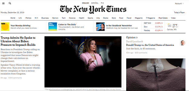
The NY Times website gives you a lot of information and takes full advantage of how big your computer screen is. The layout does feel a bit busy, but in an understandable way. Main stories on the page have one or two full sentence blurbs on their articles. It’s a very text heavy layout, but by using different sizes of font, bold text, and graphics, it still feels pretty varied. The mobile site changes format to be more vertical, with more content accessible via scrolling.

In addition to listing when the article was published underneath the blurb, the website also has the number of comments listed there as well, so you could find out just by looking which articles are creating more buzz and are getting more feedback, and stories that are live have red labels beneath them to make them stand out from the other stories on the main page.
The website for the NYTimes is pretty accessible, with options to access news in English, Spanish, or Chinese located in an easy spot right at the top of the page below the banner ad but above The New York Times header. It’s helpful that this function is so accessible when the website is first viewed.

Also the categories bar at the top scrolls with you, so if you get to the middle of the front page and decide you’d actually just like to be looking at Tech news, you can easily navigate to that. On the mobile sight, the categories and language options are available once the list icon on the upper left hand side is clicked.
Also easy to access is the button to give the NYTimes a confidential tip. Once clicked, you get a page with various options for how you would like to transfer the information you may have to the NYtimes.
Overall, the NYTimes website gives you as much information as it can on a single screen.
